Tuesday, April 19, 2011

Mohawk Community Building Logo

This is a close up view of the logo I have created for Mohawk Community Building. I wanted to keep things simple and try to maintain the integrity of the original logo. I added an underline which turns into an visual of a building with sparks of energy coming off of it.

logo_cropped

I created this image in Adobe Illustrator.

Mohawk Community Building

This is a poster I have created in Photoshop using my tablet for a non profit group from Mohawk College called Mohawk Community Building. The goal of this poster is to express who and what this group is all about. Mohawk Community Building gives back to the community by using students willing to donate their time, energy and skills to help rebuild existing and also create completely new structures for everyone to enjoy.

Mohawk_building_poster


I wanted to use silhouettes because the group represents a wide range of people. I chose bright bold colours because the organization has an upbeat and positive message to share. I created simple symbols that could become easily recognizable with Mohawk Community Building. The symbols represent the stages or steps that are involved in building projects: community, ideas, tools, and the finished product.

Wednesday, April 13, 2011

Duet

This drawing is for Illustration Friday's word of the week, "Duet." I wanted to recreate a scene where two typically nerdy characters are competing for love by coming to their interest's door bringing gifts and singing love songs.

IF: Duet

I wanted to create a view as if you the viewer were being the person sung to. I wanted to have the two "nerds" very close together and create an almost claustrophobic feeling...as if they were crammed in a doorway

Friday, April 8, 2011

When Toys Come to Life

For this weeks Illustration Friday word, "toy" I wanted to play on the idea of toys coming to life. I think that since movies like Toy Story have come out its been every child's dream to see their favorite toys come to life. I wanted to give the child have an expression of awe without showing any facial expressions. I accomplished this by playing with body language and the size ratio between the child and the mysterious silhouetted figure.

Transformers, robots in disguise

This illustration was done using a tablet and brushes in Photoshop CS4

Sunday, March 27, 2011

Mohawk Community Building Logo Design

This is a thumbnail of the logo that I propose to design. The logo will have repeated elements and colours from the poster to tie the two in together.

building_logo

Mohawk Community Building Poster

This is a thumbnail drawing of my proposed poster for Mohawk Community Building. This is an organization developed by Mohawk College that uses trade students to help rebuild structures in the community. I've decided to make it colourful and to use symbols and silhouettes to represent what their projects stand for.

building_poster

Thursday, March 24, 2011

Super Sunflower

This is another cartoon I've created for Illustration Friday's word of the week, "Cultivate." I wanted to create a character that expressed how crazy some people get when it comes to taking care of their favorite plants. Wouldn't it be nice if they looked this good!

IF: Cultivate

Stay tuned for next week's drawings!

Monday, March 21, 2011

Mustache Man

This is my newest illustration for Illustration Friday's word of the week, "stir." I have always been fascinated by people, especially eccentric ones. It seems like they always have something really interesting going on in their lives. I wanted to portray an old man with a lot of character. I used varying brush strokes to create a more textured rough effect. I also gave him a very unique mustache and made it so it formed the word of the week. I thought it would be kind of funny to add the same hair texture to the word itself.

Illustration Friday: Stir

I created this illustration using the brush tool in photoshop and my tablet.

Banksy Inspiration: McNab Pedestrian Underpass

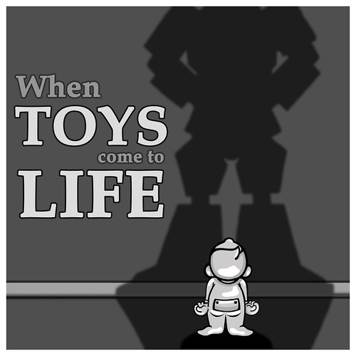
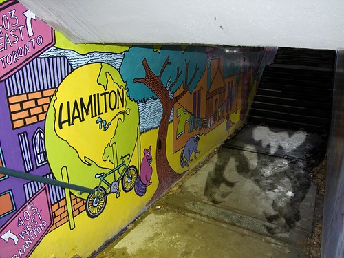
I was inspired to create this illustration by Banksy, an anonymous graffiti artist/political activist. I wanted to take a more positive spin on graffiti and show that it can be positive. Over the summer I took part in a mural that was organized by the YWCA and commissioned by the city of Hamilton. You can find this mural in the McNab pedestrian underpass, just beside the YWCA.

I added to what was already created on the walls of the tunnel by using the space on the floor. I used photoshop to construct a scene of an evil silhouette being scared out of the tunnel by the positivity of the artwork on the walls. The silhouette was intended to be a general representation of all the bad things that can happen in a place like this whether it be drugs, violence, vandalism, etc. I extended the yellow from the painted wall onto the floor and casted it over the monster's silhouette. I used some effects to make it look like the monster was disintegrating where the light was touching it.

YWCA project

I will post more images of the tunnel so the mural can be seen from different views!

Saturday, March 19, 2011

Warning...more like no warning

This is my newest post for Illustration Friday's word of the week: "warning." When I thought about the word warning I guess I thought of the opposite thing one would normally think of. I wanted to create an illustration that expressed a situation where the is little to no warning...like when a flock of pigeons happen to fly over your head.

IF: Warning...more like no warning

I created this image in Photoshop using the brush tool and my tablet.

Monday, February 28, 2011

Steps 13, 14 and 15

Here are the final steps. Create a new layer and drag it behind all of the other layers. This will be your background layer. Choose any colour you would like, but try and choose something that works with the other colours in the piece. For the next step choose a lighter hue from the background colour and use the radial gradient tool to create a light glow behind the main scene. Finally, choose a darker version of the background colour and use the linear gradient tool to create a shadow coming from beneath to give the drawing some weight.

step5

Thanks for checking out the steps. I hope this helps anyone who is interested in cartooning using Photoshop. Look out for this week's Illustration Friday word of the week!

Steps 10, 11, and 12

Here are steps 10 through 12. Finish up applying your base colours. In steps 11 and 12 you will add shadows and highlights to help bring more interest and dimension to the drawing.

step4

Final steps to come!

Steps 7, 8, and 9

Here are steps 7 through 9. Make sure to clean up all of your lines. I created this drawing in Photoshop CS4 so once I refined my lines I made a new layer underneath the outline. On this new layer you can add colour into your work using the paint brush.


step3

More steps to follow...

Steps 4,5 and 6

Here are the next couple of steps. Give your character(s) more detail. Think of facial expression, clothing, and other accessories. Make a space for the cupcake to go. Sketch in the basic shape of the cupcake and then add in more detail.

step2

More steps to follow...

Steps 1,2 and 3

Here are the first few steps. Use basic shapes to construct the general look of your character.Do the same for any other items or characters in the scene. Once this is done try and erase the areas that overlap, revealing more of the true form.

step1_yummy in my tummy

More steps to follow...

yummy in my tummy

This is another cartoon for Illustration Friday's current word of the week, "layer." I was thinking about how kids never seem to know how much is too much, especially when it comes to sweets. I was inspired by my brother when he used to decorate cookies with us and would pile on as many toppings as he could.

Illustration Friday: layer

If you would like to know how I created this image or are looking to recreate something similar yourself, the following posts will provide you with step by step instructions.

Wednesday, February 23, 2011

Here are a set of illustrations for an article that I did for an article on viceland.com called, "Getting Myself Mcfired." The set includes one large illustration and then three smaller spots. The goal was to create illustrations that relate to the content of the article and that could actually be placed inside.

Mcfired Editorial

Friday, February 18, 2011

Not Again!....

I was inspired to create this cartoon for Illustration Friday's word of the week, "sweater" when I thought of the funny gifts that older relatives give to kids. The most hilarious gifts are the one's that are hand made...they are always great conversation pieces.

Illustration Friday: Sweater

I created this illustration using Photoshop. I started by sketching out the black outlines and then filling in the rest with colour. Look out for next week's post! :)

Sunday, February 13, 2011

Time Machine

Here is my latest post for Illustration Friday's word of the week, "reverse." When I thought of the word reverse I thought of going back in time. I always think of getting old and how boring birthdays must become the more and more limited are. I thought it would be funny to show an old man remembering his youth while he gums on his applesauce cake.

Illustration Friday: Reverse

This illustration was created using Photoshop CS4. I drew the line work by hand initially, scanned the sketch in and then used a series of brushed with my tablet to fill in the rest.

Wednesday, February 2, 2011

Surrender....

This is my illustration for Illustration Fridays word of the week, "Surrender." I was inspired to create this cartoon when I recalled my boxing day experience at the mall this year. I have never felt so crowded and uncomfortable in my entire life. I especially couldn't believe all of the mother's who were out who all seemed to be alone or without their significant others with a ton of kids. I can't imagine trying to juggle all of those kids at once...nevermind trying to shop!

Illustration Friday, Surrender

This piece was created with Photoshop CS4 using a wacom tablet. Look out for next week's post!

Monday, January 31, 2011

Are you Chicken?!?!

When I thought of the word "chicken" for the Illustration Friday site I thought of how funny it was that people actually referred to people who are scared or timid as being "chicken." I thought it would be funny to turn things around and look at the saying through a chicken's point of view.

Chicken

This was done by hand using pen and ink and then adjusted/edited in photoshop, a version in colour will be up soon!

Dusty

This is my latest project! This is a cartoon done on photoshop with a simple brush using the tablet. This cartoon features a caricature named "Dusty." The original concept started with the word "dusty" which I decided to turn into a person. I started thinking about where Dusty would work and live.

Illustration Friday... dusty at your service

Look out for this weeks post for Illustration Friday for the word "Surrender."