
Sunday, March 27, 2011
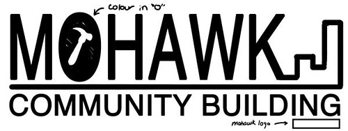
Mohawk Community Building Logo Design
This is a thumbnail of the logo that I propose to design. The logo will have repeated elements and colours from the poster to tie the two in together.
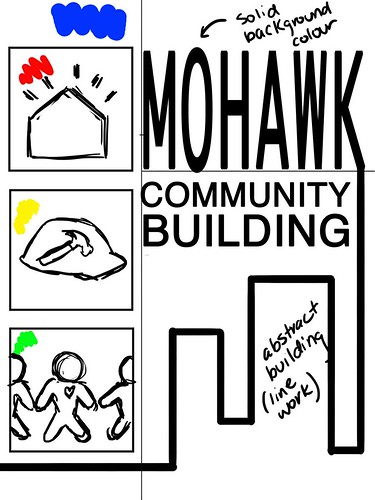
Mohawk Community Building Poster
This is a thumbnail drawing of my proposed poster for Mohawk Community Building. This is an organization developed by Mohawk College that uses trade students to help rebuild structures in the community. I've decided to make it colourful and to use symbols and silhouettes to represent what their projects stand for.
Thursday, March 24, 2011
Super Sunflower
This is another cartoon I've created for Illustration Friday's word of the week, "Cultivate." I wanted to create a character that expressed how crazy some people get when it comes to taking care of their favorite plants. Wouldn't it be nice if they looked this good!

Stay tuned for next week's drawings!
Stay tuned for next week's drawings!
Monday, March 21, 2011
Mustache Man
This is my newest illustration for Illustration Friday's word of the week, "stir." I have always been fascinated by people, especially eccentric ones. It seems like they always have something really interesting going on in their lives. I wanted to portray an old man with a lot of character. I used varying brush strokes to create a more textured rough effect. I also gave him a very unique mustache and made it so it formed the word of the week. I thought it would be kind of funny to add the same hair texture to the word itself.
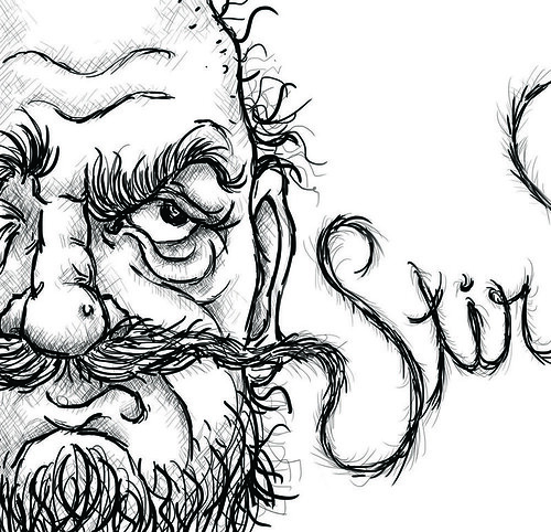
I created this illustration using the brush tool in photoshop and my tablet.
I created this illustration using the brush tool in photoshop and my tablet.
Banksy Inspiration: McNab Pedestrian Underpass
I was inspired to create this illustration by Banksy, an anonymous graffiti artist/political activist. I wanted to take a more positive spin on graffiti and show that it can be positive. Over the summer I took part in a mural that was organized by the YWCA and commissioned by the city of Hamilton. You can find this mural in the McNab pedestrian underpass, just beside the YWCA.
I added to what was already created on the walls of the tunnel by using the space on the floor. I used photoshop to construct a scene of an evil silhouette being scared out of the tunnel by the positivity of the artwork on the walls. The silhouette was intended to be a general representation of all the bad things that can happen in a place like this whether it be drugs, violence, vandalism, etc. I extended the yellow from the painted wall onto the floor and casted it over the monster's silhouette. I used some effects to make it look like the monster was disintegrating where the light was touching it.
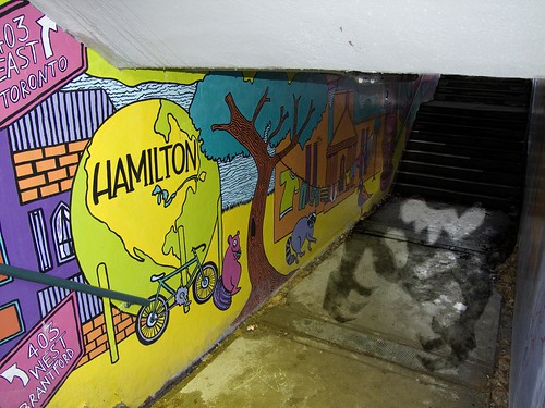
I will post more images of the tunnel so the mural can be seen from different views!
I added to what was already created on the walls of the tunnel by using the space on the floor. I used photoshop to construct a scene of an evil silhouette being scared out of the tunnel by the positivity of the artwork on the walls. The silhouette was intended to be a general representation of all the bad things that can happen in a place like this whether it be drugs, violence, vandalism, etc. I extended the yellow from the painted wall onto the floor and casted it over the monster's silhouette. I used some effects to make it look like the monster was disintegrating where the light was touching it.
I will post more images of the tunnel so the mural can be seen from different views!
Saturday, March 19, 2011
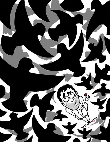
Warning...more like no warning
This is my newest post for Illustration Friday's word of the week: "warning." When I thought about the word warning I guess I thought of the opposite thing one would normally think of. I wanted to create an illustration that expressed a situation where the is little to no warning...like when a flock of pigeons happen to fly over your head.
I created this image in Photoshop using the brush tool and my tablet.
I created this image in Photoshop using the brush tool and my tablet.
Subscribe to:
Comments (Atom)